The notion of turning a page and hearing the paper leaf over is something that enriches the experience of visiting a gallery or enjoying the contemplative afterglow of an exhibition.
The dry slide of your finger tips and the gentle crumple that follows floats towards your ears. This is the sound of the brief yet suspenseful anticipation you feel before you see what is on the next page.
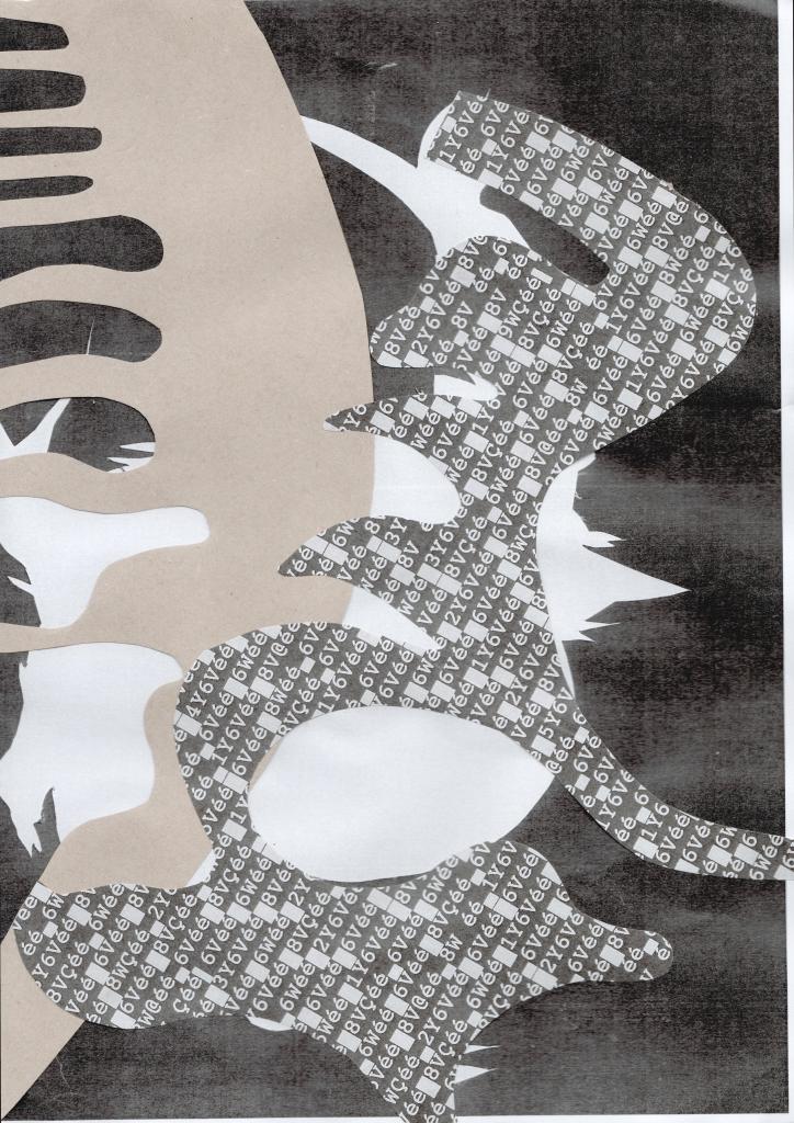
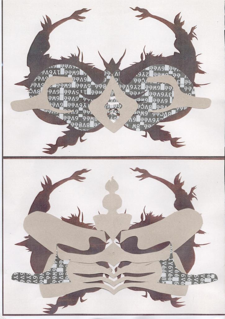
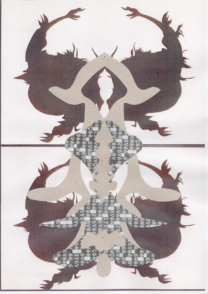
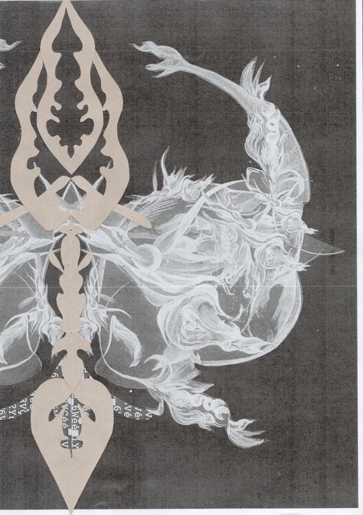
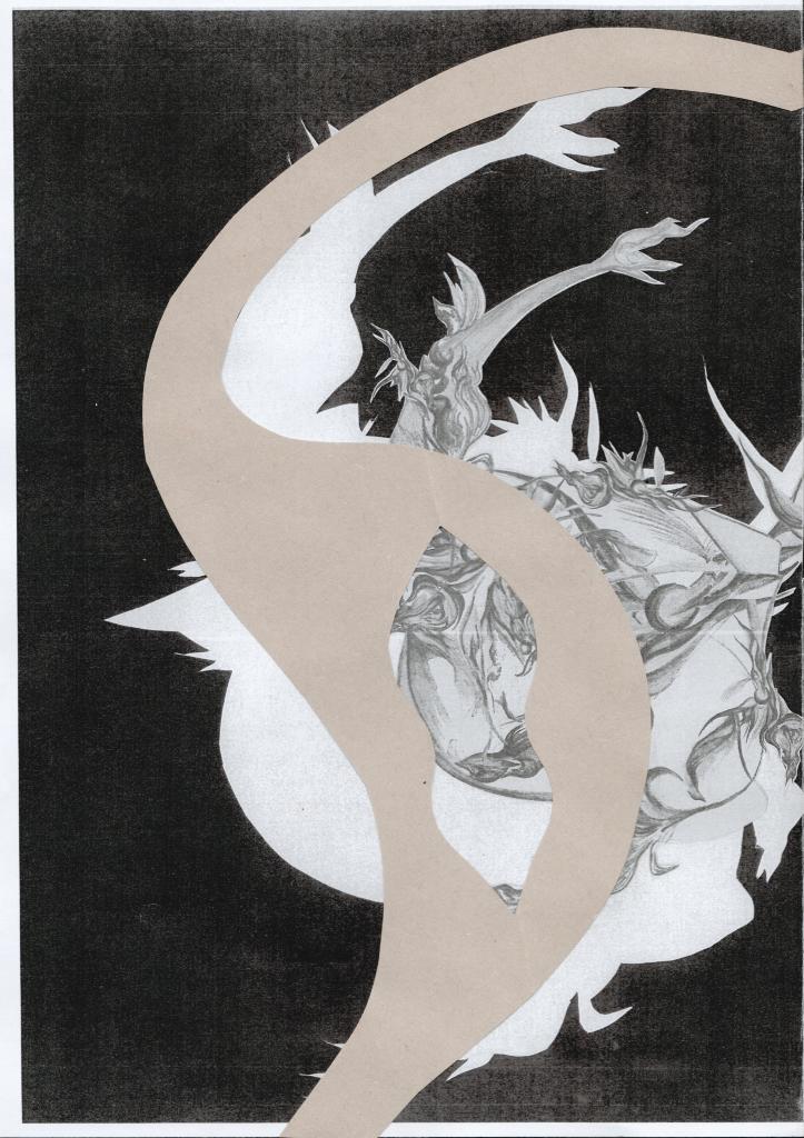
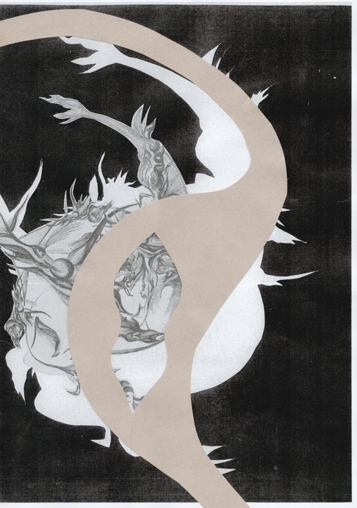
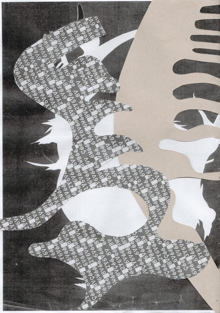
BoNT on a plate knew no bounds and did not conform to the qualities necessary within the confines a tangible publication. With no definite start or end, my sculptural installation lacked spacial awareness. Why would it know its place? So, when considering the composition for this exhibitions book, the shapes needed to be contained. By using cut-outs of the negative space left over from the paper installation, a doubling affect was achieved within the mock-up. I also incorporated salvaged cut-outs of the real thing that had since been disassembled. The shapes you see in the book appear reluctantly repositioned. If the forms outgrew the page, they spilled over to the next with assertion. Determining the layout of the following page; the previous and current state of BoNT came to co-exist. Like something that has mutated in order to survive. What once sprawled out before you, embodying its individual freedom was now ambivalent to the forms you could hold in your hands. It has re-spawned. I want these opposing formats to be clear. The fluidity and connection between the external and internal materialisation of BoNT should be palpable. If the installation was something that continued to outgrow its space, the publication needed to be confined. The pages were an A4 vessel for examination.
The session began with the exploration of each others work in its new format. I will make note to the fact that few of us decided to include written work within the pages we had put forward to combine. When designing a publication it is not crucial to rationalise its aesthetics with artists statements or annotations. The value of looking without written direction was brought to our attention by Lisa Bernard, who was leading our practical session. By this I mean to say that the readers interpretation can be interrupted by the artists intention, and so allowing your work to be critiqued without its constructed context can bring new, otherwise unseen qualities to your own work.
Excogitating the idea of individual engagement, our group set out to create an exhibition book that allowed its reader to form its content – to contribute. Our outcome was something that I will describe as a compilation of collaged material. Some of which was loose in the centre of the book for the reader to determine its position on the pages. Saying this, we hand drew outlines of Abigail T’s computer rendered hands as a suggestion. An attempt to lead the reader to follow our lead; this could either be observed or ignored. I will liken this notion of placement to that of a childrens’ sticker book. Matching the positive spaces to their negative counterparts. Perhaps it is obvious where the shapes are meant to fit. But staying in line isn’t always fun…
I like the idea of something being explicitly explained, without the use of words. Moving towards the spring exhibition, ignorance and intention could be themes that move on from the idea of a miracle toxin whilst maintaining the female form as its vessel of expression.
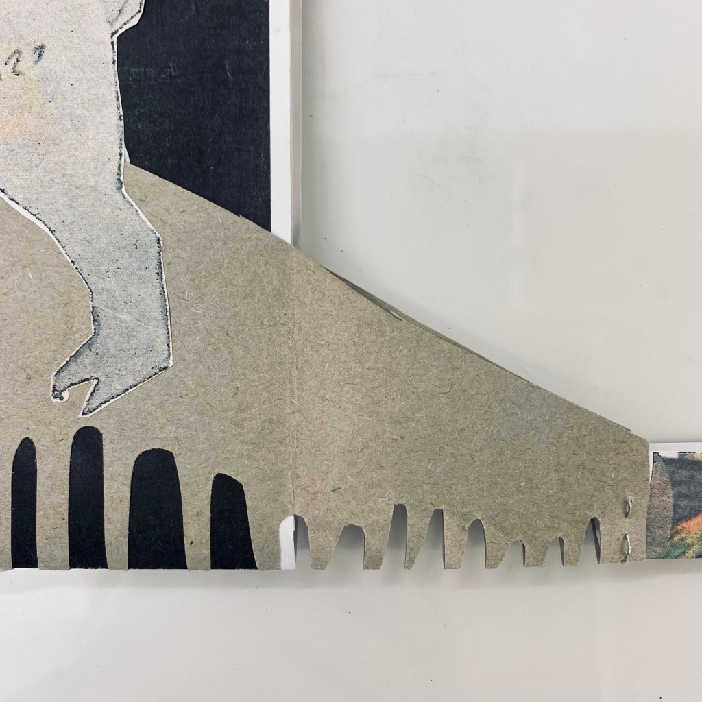
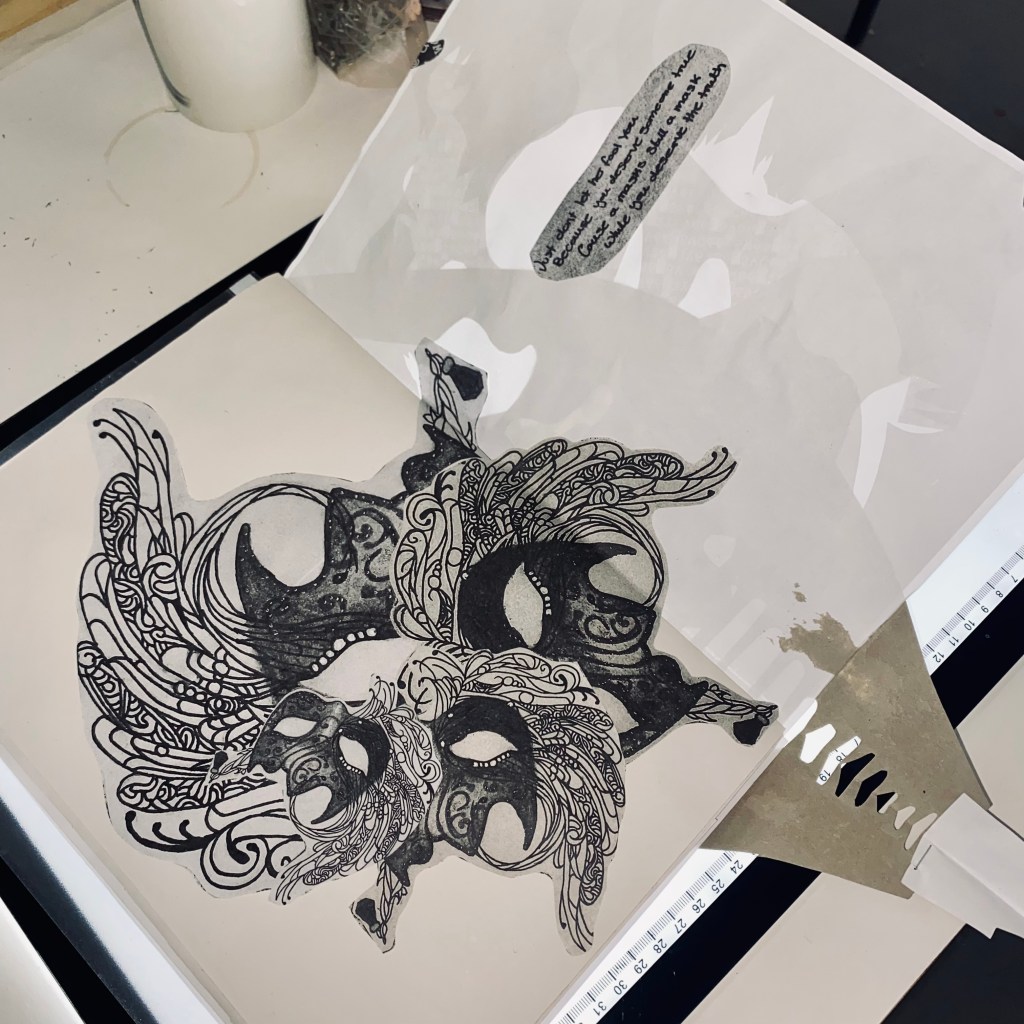
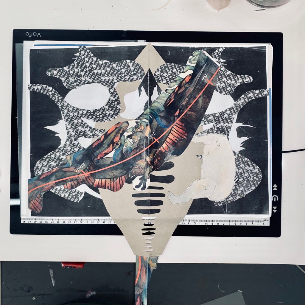
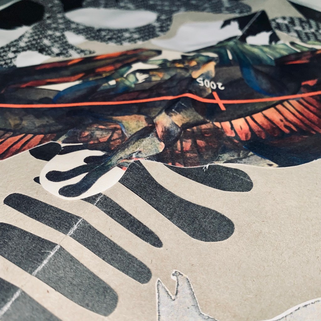
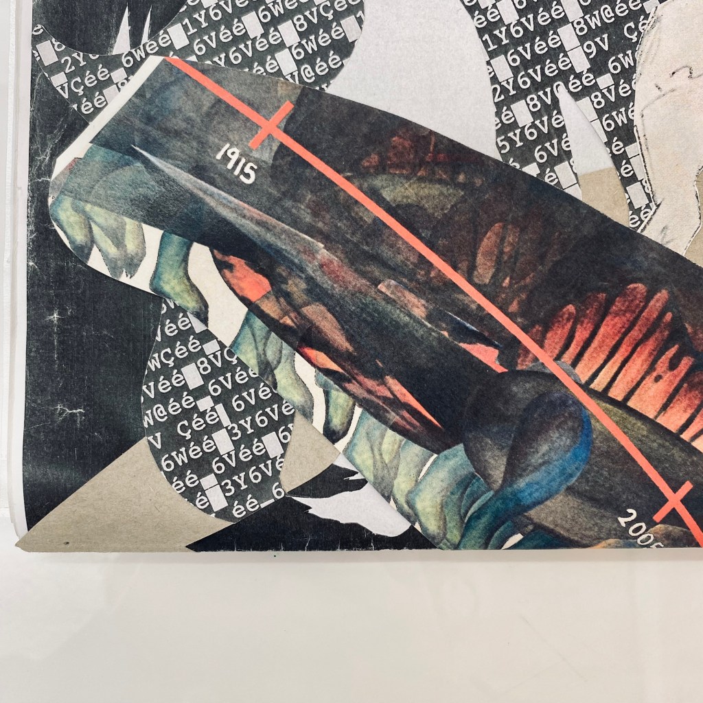
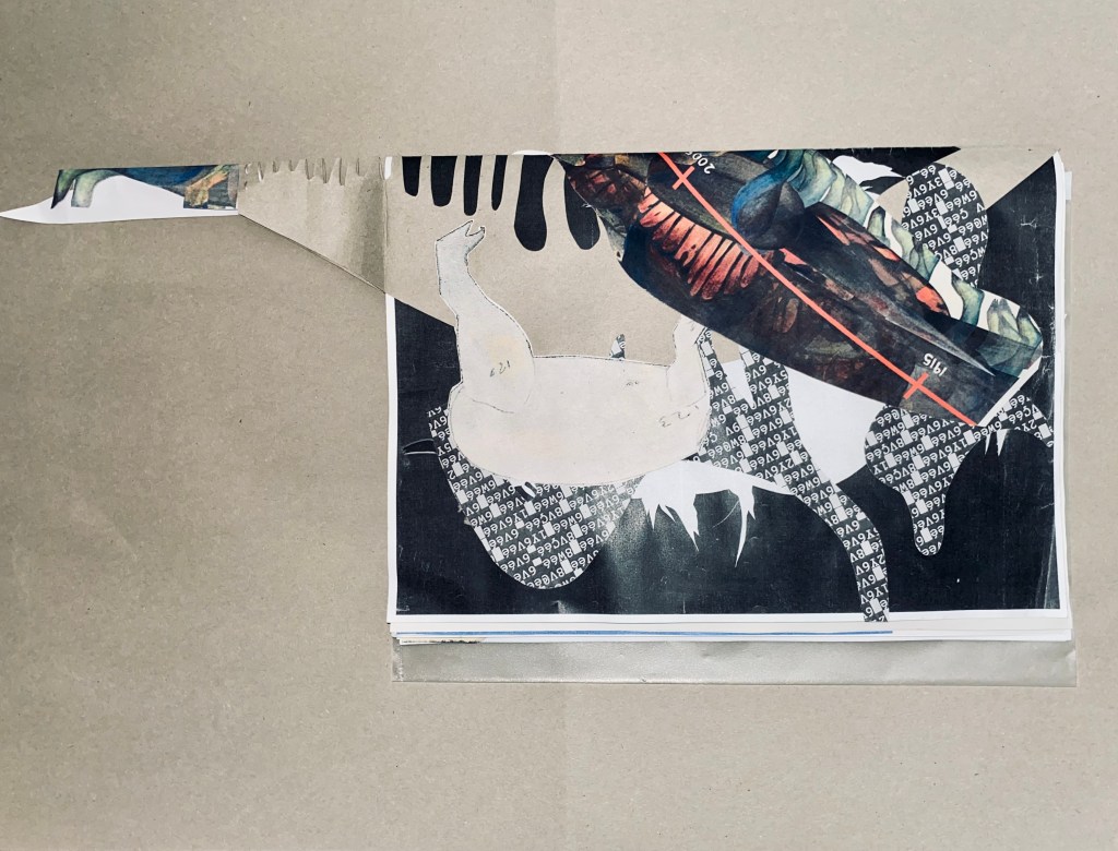
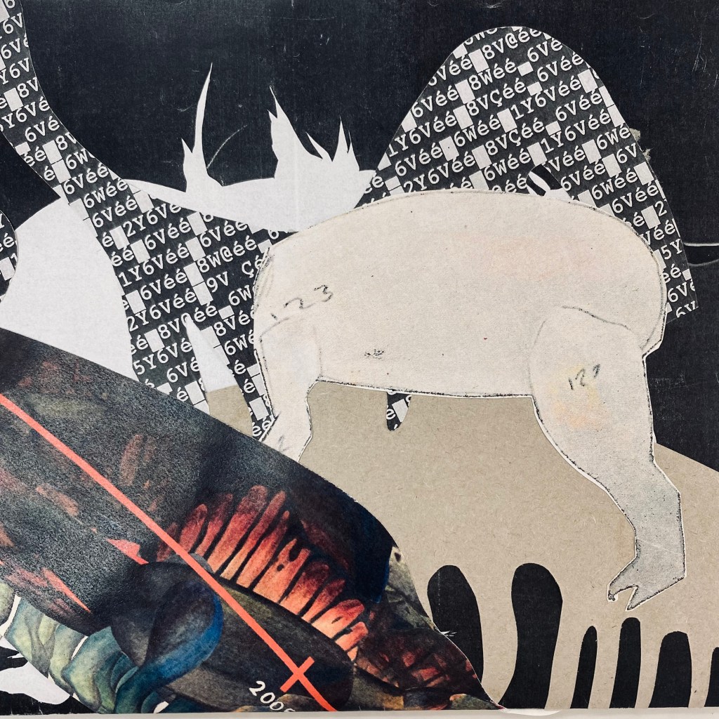
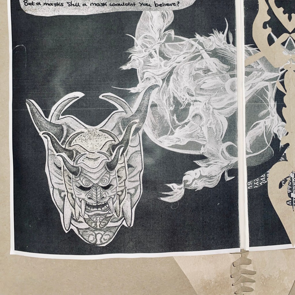
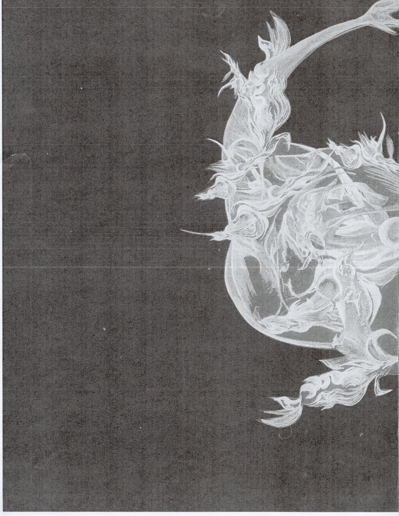
Above you’ll see selected photographs of the final mock-up of our publication.
